
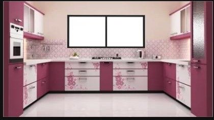
Colour is the one kitchen decision you'll live with for the longest, so it's worth slowing down on. Here's how we guide customers through picking a shutter colour that photographs beautifully today and still feels right years from now.
Start With Your Room's Natural Light
A kitchen that gets plenty of daylight can carry darker, richer shutter tones — deep blues, charcoal, forest green — without feeling closed in. A kitchen with limited natural light generally looks and feels better in lighter tones: soft whites, warm beige, or light wood-grain finishes that bounce available light around the room instead of absorbing it.
Match Colour to Kitchen Size
- Small kitchens: light, uniform colours make the room feel bigger and less broken up.
- Large kitchens: can handle bolder colours, two-tone combinations, or a dark island against lighter perimeter cabinets.
- Either size: a light countertop against darker shutters (or vice versa) adds visual interest without overwhelming the room.
Two-Tone Combinations That Work
Two-tone kitchens — a different colour for base and wall cabinets — are one of the most requested looks right now, and for good reason: they add depth without the commitment of an all-bold kitchen. A popular, safe combination is a neutral wall cabinet (white, cream, light grey) paired with a bolder base cabinet (navy, olive, deep maroon or matte black), which grounds the room visually while keeping the upper half light and airy.
Think Beyond the Shutter Itself
Your shutter colour doesn't exist in isolation — it has to work with your flooring, countertop, backsplash and even wall paint. Before finalizing, hold a sample swatch against your actual flooring and countertop material in the room's real lighting; colours can look completely different under kitchen lighting than they do on a showroom wall or a screen.
Bring us your flooring or countertop sample (or a photo) during your consultation and we'll help you shortlist shutter colours that are guaranteed to work together.
Colours That Age Well
If you'd rather not think about your kitchen colour again for the next decade, neutral tones — whites, warm greys, soft wood-grains — are the safest long-term choice and remain easy to sell or renovate around. Save bold, trend-driven colours for smaller or lower-cost elements you're comfortable changing later, like handles or a backsplash.
Frequently Asked Questions
What is the most popular kitchen shutter colour combination in 2026?
Two-tone kitchens — a light neutral wall cabinet paired with a bolder base cabinet colour — continue to be the most requested combination among our customers.
Do dark shutters make a kitchen look smaller?
In a kitchen with limited natural light, yes, dark shutters can make the room feel more enclosed. In a bright, well-lit kitchen, darker tones can look striking without shrinking the space.
Should shutter colour match the flooring or contrast with it?
Either works — the key is deciding intentionally and checking the combination in your room's actual lighting before finalizing, rather than relying on a showroom sample alone.